Tile
Tiles are a highly flexible component for displaying a wide variety of content, including information, getting started, how-to, next steps, and more.
Overview
Carbon ships a basic tile structure that responds to the grid. Based on the layout structure, tiles can contain type, images and/or a block of color. As tiles have no pre-set styles for the content inside, the tile component usage guidance focuses on basic tiles’ functions. It does not include the complex structure of the information or additional interactive elements that a tile contains.
Tiles versus Cards
Tiles are simple and foundational. Cards can be very complex. They are built upon the tile foundation and have various patterns, multiple actions, overflow menus, selectable features, etc. Carbon does not have a Card pattern yet, but we link out to several card patterns within our pattern asset library (PAL) ecosystem below:
- Productive vs. Expressive cards (Carbon for Cloud & Cognitive)
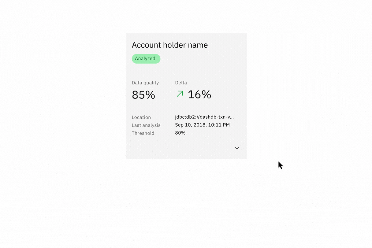
- Dashboard cards (AI Applications Design)
- Card (Carbon for IBM.com)
When to use
Tiles are reusable components that provide shortcuts to building cards and other modules. Use tiles as part of the user’s main workstream. Here are some common use cases for when to use tiles:
- To contain related groupings of information or actions
- To guide users to take actions or navigate
- To present options for single or multiple selections
- To hide or show large amounts of content
When not to use
Tiles reside in the same plane as the background layer—they do not have elevation. Tiles organize essential information and have the same visual hierarchy as content within the same page.
Do not add drop shadow to tiles and use them on screen to reveal secondary information, actions, or notifications. Use modals, popover, and dialog which have elevation and are appropriate for this function instead.
Live demo
<Tile>Default tile</Tile>
Tile variants
Tiles can function or be implemented in four ways—base, clickable, selectable, or expandable. These variations of tiles are flexible enough to support a variety of different use cases when building more complicating card features.
| Variant | Purpose |
|---|---|
| Base | For high-level, short, and digestible content pieces such as features, plans, or services offered |
| Clickable | For prompting an action, navigating or directing to other pieces of information about the subject matter |
| Selectable | For presenting options to a user in a structured manner, such as a set of pricing plans |
| Expandable | For hiding and revealing a large amount of content in order to focus on specific pieces of info |
Base
Base tiles are used to display information to the user, such as features or services offered. Base tiles are often seen on marketing pages to promote content or on dashboards that are highly interactive. These tiles can have internal calls-to-action (CTAs), such as a button or a link.

Clickable
Clickable tiles can be used as navigational items, where the entire tile is a clickable state, which redirects the user to a new page. Clickable tiles cannot contain separate internal CTAs but can contain pictograms, icons, or media such as illustrations or images.

Selectable
Selectable tiles work well for presenting options to a user in a structured manner, such as a set of pricing plans. Selectable tiles may contain internal CTAs (like links to docs) if the internal CTA is given its own click target.
Selectable tiles can either have a single select state working like a radio button, or multi-select state working as a checkbox.

Single select tiles work like radio-buttons

Multi-select tiles work like checkboxes
Expandable
Expandable tiles are helpful for hiding and showing large amounts of content to a user. When expanded, tiles push content down the page. They allow the user to specifically focus on featured content while having access to the rest of the information. Expandable tiles can contain internal CTAs (like links to docs) if they are given their own click targets.
Formatting
Anatomy

Container: Includes a title, optional label, and the close icon.
Content area: Contains the information and/or controls needed to complete the modal’s task. It can include message text and components.
Sizing
The width varies depending on three basic grid modes: wide, narrow, and condensed. The height varies depending on the amount of content placed within it, but still follows the aspect ratio.
Aspect ratios are written out as a formula of width to height, such as 3:2. It’s important to remember that while two images can have the same aspect ratio, they can have varying images sizes.
Experimental tiles are now available. This addition enhances accessibility and only applies to the visual, not the functions of tiles. Though we are not deprecating the current tiles, we encourage all design teams to use the new experimental tiles in their products moving forward.

Tiles get wider as the browser gets larger
Alignment
Icon and call-to-action button
With clicktable tiles, place the icon at the bottom right to indicate navigation. Use the interactive token for the icon. Avoid using interactive links that can be confusing as multiple click targets.
With non-clickable tiles(or base tile), place the interactive components, such as button or link, at the bottom left to indicate call-to-action.

Do left align icon, link, or text when it is by itself.

Do not right align an icon, link, or text when it is by itself

Do move icon to the right when there is an icon or pictogram.

Do move icon to the right when there is text or link.
Tile groups
Tile groups are a useful way of aligning tiles that have a strong relationship. Tile groups flow horizontally left to right usually and have similar hierarchical importance like navigation or catalog tiles.

Example image of how tiles are built on the wide grid.

Example image of how tiles are built on the narrow grid.

Example image of how tiles are built on the condensed grid.
Layout
There are three basic layouts for tiles: standard, vertical masonry, and horizontal masonry. The standard layout will be the most commonly used version.
- Standard layout tiles are the same in height and width as the rest of them in the group.
- A vertical masonry layout can vary in height, but is consistent in width.
- A horizontal masonry layout can vary in width. Rows of tiles may vary in height, but the tiles within a row should be consistent in height.

Standard layout for tiles

An example of the standard layout

Vertical masonry layout for tiles

An example of the vertical masonry layout

Horizonal masonry layout for tiles

An example of the horizonal masonry layout
Behaviors
Interactions
Mouse
Users can trigger an item by clicking anywhere in any tile container, except base tiles.

Clickable, expandable, and selectable tiles are clickable anywhere within the tile.

Base tiles are static, except buttons or links .
Expandable tiles can either be triggered as a whole or only contain internal CTA’s if they are given their own click targets and the tile’s click target is reduced to only the chevron icon.

Keyboard
Specific keyboard interactions will depend on the type of tile you are using and what content it contains but all types of tiles can take focus.
| Key | Interaction |
|---|---|
| Tab | Move forward through tiles (if tiles themselves are clickable) and interactive elements within the tiles in a logical order |
| Shift + Tab | Move backward through tiles (if tiles themselves are clickable) and interactive elements within the tiles in a logical order |
| Return or Enter | Return or enter will open the tile (if the tile itself is clickable). If the tile is not clickable but has interactive elements, their corresponding actions are performed |
| Space | If the tile is selectable, the space bar will toggle tile selection |
Related
Grid
To learn more about how to build tiles correctly on the grid, see Carbon’s 2x grid.
Aspect ratio
Aspect ratio is important when building tiles and images. For further guidance, see Carbon’s Aspect ratio and its implementation.
Buttons
When in doubt, use full-span button alignment within tiles. For further guidance, see Carbon’s buttons.
Link
Link has variants depending on the context. For further guidance, see Carbon’s link.
References
Hagan Rivers, Interactions design with cards/tiles (Medium, 2017)
Feedback
Help us improve this component by providing feedback, asking questions, and leaving any other comments on GitHub.